© 2022 ZECH, Paul.
© 2022 ZECH, Paul. Selected works following no particular order.
Paul Zech works in graphic design as an interrelated / multidisciplinary / time-sensitive / visual / audible / textual / articulated / tactile approach with momentary to ephemeral outcomes.
Open for commission in creative directions, graphic design, visual identities and research.
Full portfolio with CV on request [click link below] © 2022 ZECH, Paul. Selected works following no particular order.
Paul Zech works in graphic design as an interrelated / multidisciplinary / time-sensitive / visual / audible / textual / articulated / tactile approach with momentary to ephemeral outcomes.
Open for commission in creative directions, graphic design, visual identities and research.
Full portfolio with CV on request [click link below]
Paul Zech works in graphic design as an interrelated / multidisciplinary / time-sensitive / visual / audible / textual / articulated / tactile approach with momentary to ephemeral outcomes.
Open for commission in creative directions, graphic design, visual identities and research.
Full portfolio with CV on request [click link below] © 2022 ZECH, Paul. Selected works following no particular order.
Paul Zech works in graphic design as an interrelated / multidisciplinary / time-sensitive / visual / audible / textual / articulated / tactile approach with momentary to ephemeral outcomes.
Open for commission in creative directions, graphic design, visual identities and research.
Full portfolio with CV on request [click link below]
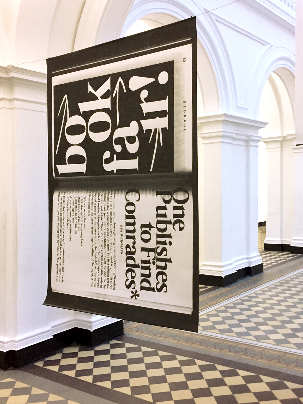
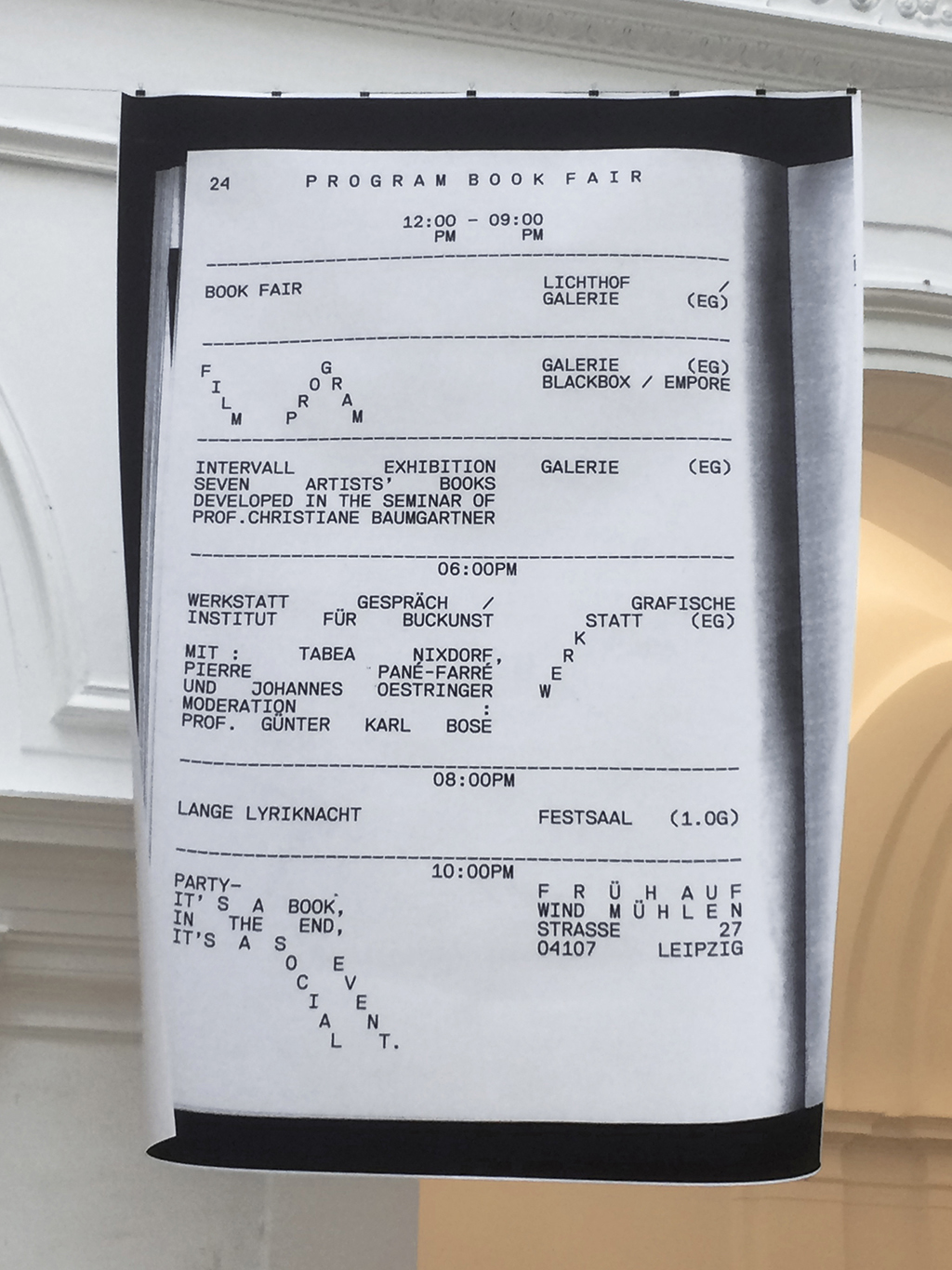
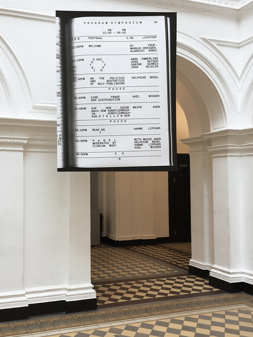
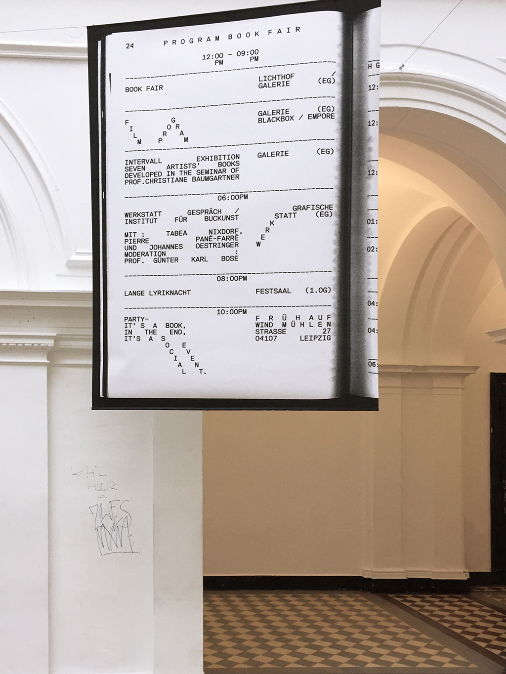
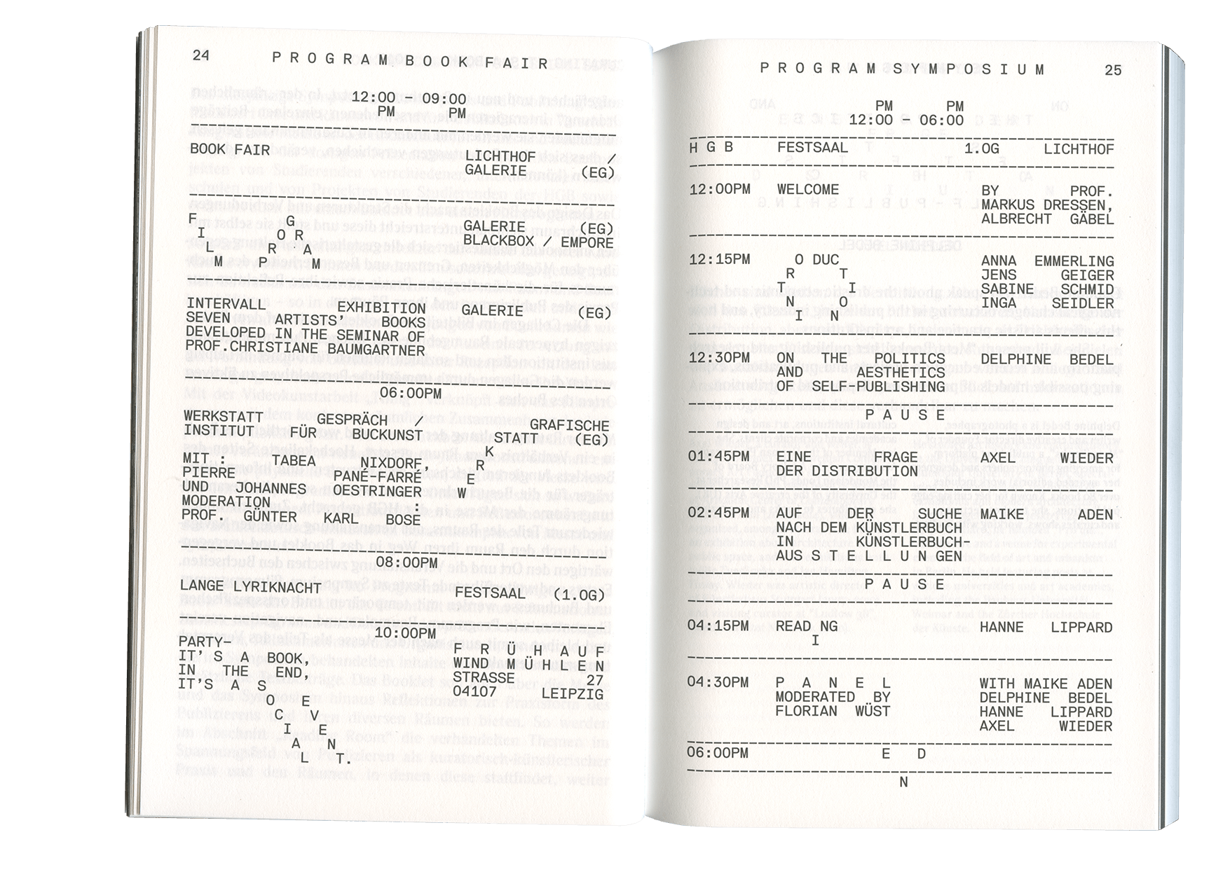
A book-fair’s reader becomes signage and vice versa.
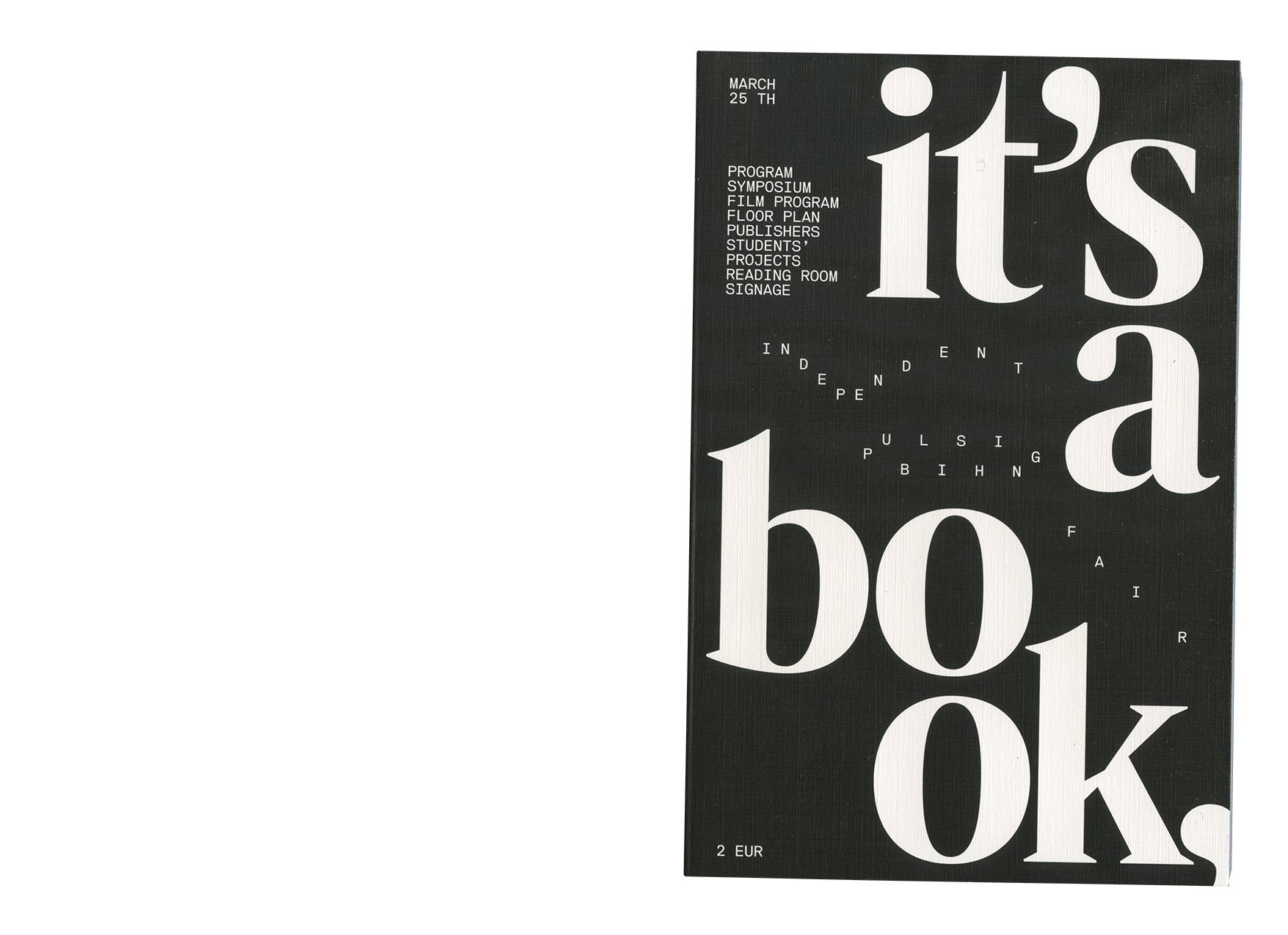
📖 IT’S A BOOK 2017
Reader for the Independent Publishing Fair It’s a Book in Leipzig. The reader was conceived as a physical enhancement and representation of the fair and it’s symposium. Single pages were scaled up and used as signage, bringing the book into public, social and cultural space and vice versa – the essential theme of the accompanying symposium.
visual identity, publication and signage in collaboration w/ Sibel Beyer, Elias Erkan, Philip Markert, Thomas Spieler 📖 IT’S A BOOK
Reader for the Independent Publishing Fair It’s a Book in Leipzig. The reader was conceived as a physical enhancement and representation of the fair and it’s symposium. Single pages were scaled up and used as signage, bringing the book into public, social and cultural space and vice versa – the essential theme of the accompanying symposium.
visual identity, publication and signage in collaboration w/ Sibel Beyer, Elias Erkan, Philip Markert, Thomas Spieler
Reader for the Independent Publishing Fair It’s a Book in Leipzig. The reader was conceived as a physical enhancement and representation of the fair and it’s symposium. Single pages were scaled up and used as signage, bringing the book into public, social and cultural space and vice versa – the essential theme of the accompanying symposium.
visual identity, publication and signage in collaboration w/ Sibel Beyer, Elias Erkan, Philip Markert, Thomas Spieler 📖 IT’S A BOOK
Reader for the Independent Publishing Fair It’s a Book in Leipzig. The reader was conceived as a physical enhancement and representation of the fair and it’s symposium. Single pages were scaled up and used as signage, bringing the book into public, social and cultural space and vice versa – the essential theme of the accompanying symposium.
visual identity, publication and signage in collaboration w/ Sibel Beyer, Elias Erkan, Philip Markert, Thomas Spieler
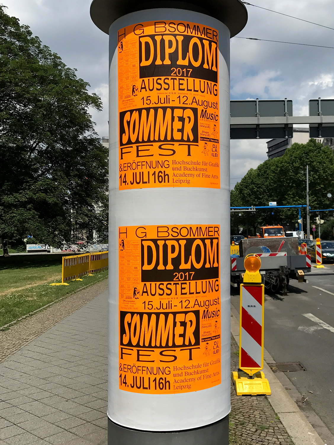
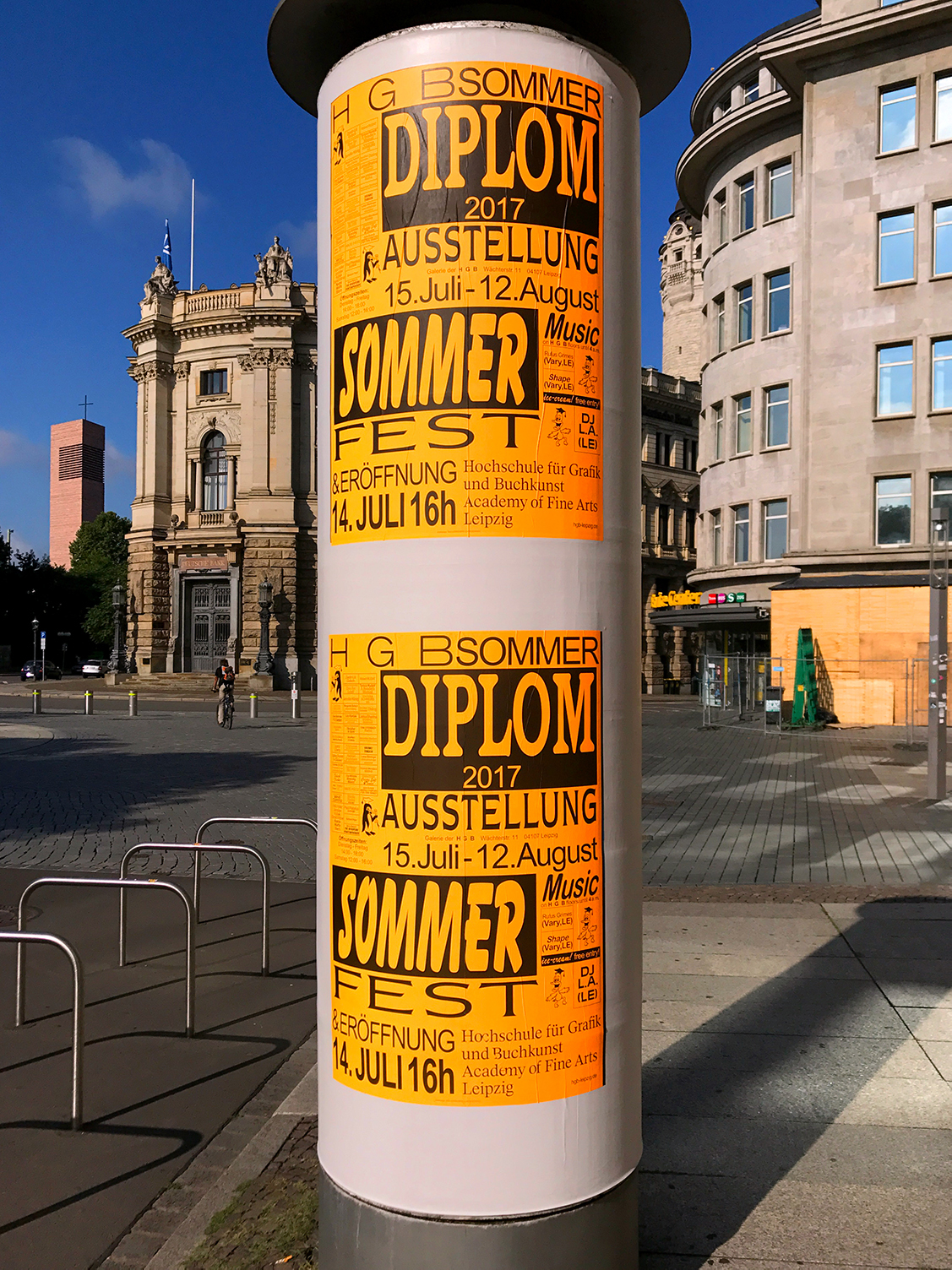
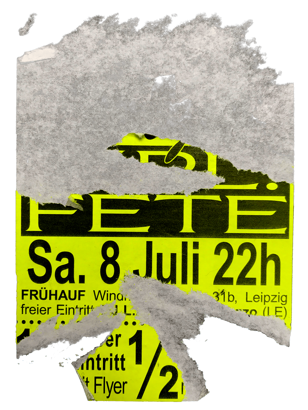
art-academy-summer-fair.
🟧 HGB SUMMER 2017
An approach to open up the Academy of Fine Arts Leipzig to all general public for the annual diploma exhibition and summer festivities.
visual identity, posters (unicolor / split-fount offset prints) and ephemera in collaboration w/ Jacob Schenck 📄 HGB SUMMER
An approach to open up the Academy of Fine Arts Leipzig to all general public for the annual diploma exhibition and summer festivities.
visual identity, posters (unicolor / split-fount offset prints) and ephemera in collaboration w/ Jacob Schenck
An approach to open up the Academy of Fine Arts Leipzig to all general public for the annual diploma exhibition and summer festivities.
visual identity, posters (unicolor / split-fount offset prints) and ephemera in collaboration w/ Jacob Schenck 📄 HGB SUMMER
An approach to open up the Academy of Fine Arts Leipzig to all general public for the annual diploma exhibition and summer festivities.
visual identity, posters (unicolor / split-fount offset prints) and ephemera in collaboration w/ Jacob Schenck
(☮︎)
🔄 NEW PEACE SYMBOL
[as proposed to the Schirn Kunsthalle Frankfurt]
The CND symbol, commonly known as the peace symbol designed by G. Holtom combines a circle with simplified flag semaphore symbols for the letters N (two flags held 45° down on both sides) and D (two flags, one up and one down) – standing for (N)uclear (D)isarmament.
Based on its past composition the new symbol elaborates its literal meaning by combining any possible letter combination. Whether it stands for No Borders! or Close Borders!, for No more War or Fight for Freedom, for Free Water or Free Market, for Gender Equality, Freedom of Speech or simply Love. It stands for no final definition of peace and an ever changing re-orientation towards an assumed better future.
the chosen medium .gif suggests an ever-changing never finite form
⚠️ Warning: this video contains strobe lighting and could potentially trigger seizures for people with photosensitive epilepsy. Viewer discretion is advised. 🔄 NEW PEACE SYMBOL
[as proposed to the Schirn Kunsthalle Frankfurt]
The CND symbol, commonly known as the peace symbol designed by G. Holtom combines a circle with simplified flag semaphore symbols for the letters N (two flags held 45° down on both sides) and D (two flags, one up and one down) – standing for (N)uclear (D)isarmament.
Based on its past composition the new symbol elaborates its literal meaning by combining any possible letter combination. Whether it stands for No Borders! or Close Borders!, for No more War or Fight for Freedom, for Free Water or Free Market, for Gender Equality, Freedom of Speech or simply Love. It stands for no final definition of peace and an ever changing re-orientation towards an assumed better future.
the chosen medium .gif suggests an ever-changing never finite form
⚠️ Warning: this video contains strobe lighting and could potentially trigger seizures for people with photosensitive epilepsy. Viewer discretion is advised.
[as proposed to the Schirn Kunsthalle Frankfurt]
The CND symbol, commonly known as the peace symbol designed by G. Holtom combines a circle with simplified flag semaphore symbols for the letters N (two flags held 45° down on both sides) and D (two flags, one up and one down) – standing for (N)uclear (D)isarmament.
Based on its past composition the new symbol elaborates its literal meaning by combining any possible letter combination. Whether it stands for No Borders! or Close Borders!, for No more War or Fight for Freedom, for Free Water or Free Market, for Gender Equality, Freedom of Speech or simply Love. It stands for no final definition of peace and an ever changing re-orientation towards an assumed better future.
the chosen medium .gif suggests an ever-changing never finite form
⚠️ Warning: this video contains strobe lighting and could potentially trigger seizures for people with photosensitive epilepsy. Viewer discretion is advised. 🔄 NEW PEACE SYMBOL
[as proposed to the Schirn Kunsthalle Frankfurt]
The CND symbol, commonly known as the peace symbol designed by G. Holtom combines a circle with simplified flag semaphore symbols for the letters N (two flags held 45° down on both sides) and D (two flags, one up and one down) – standing for (N)uclear (D)isarmament.
Based on its past composition the new symbol elaborates its literal meaning by combining any possible letter combination. Whether it stands for No Borders! or Close Borders!, for No more War or Fight for Freedom, for Free Water or Free Market, for Gender Equality, Freedom of Speech or simply Love. It stands for no final definition of peace and an ever changing re-orientation towards an assumed better future.
the chosen medium .gif suggests an ever-changing never finite form
⚠️ Warning: this video contains strobe lighting and could potentially trigger seizures for people with photosensitive epilepsy. Viewer discretion is advised.
cover heartwork.
⭕️ GIANI COVER ARTWORK 2020
Logotype for Giani «Nichts für Dich» single 💿 GIANI COVER ARTWORK
Logotype for Giani «Nichts für Dich» single
Logotype for Giani «Nichts für Dich» single 💿 GIANI COVER ARTWORK
Logotype for Giani «Nichts für Dich» single
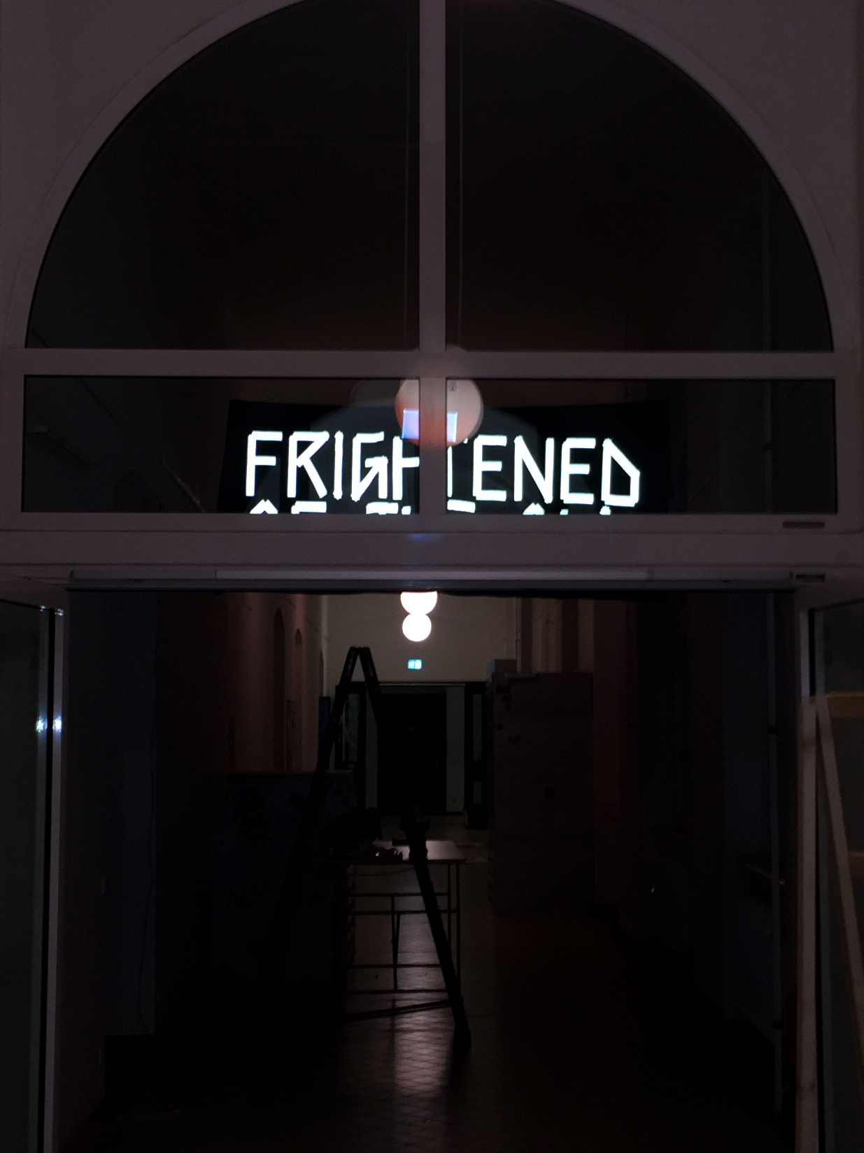
Frightened of the Old.
👁 FRIGHTENED OF THE OLD 2017
Illuminating an anxiety that haunts the academy, this banner hung above visitors of the HGB Rundgang, only visible to camera flashes.
reflective fabric on 3 × 1,5 m black denim. ✨ FRIGHTENED OF THE OLD
Illuminating an anxiety that haunts the academy, this banner hung above visitors of the HGB Rundgang, only visible to camera flashes.
reflective fabric on 3 × 1,5 m black denim.
Illuminating an anxiety that haunts the academy, this banner hung above visitors of the HGB Rundgang, only visible to camera flashes.
reflective fabric on 3 × 1,5 m black denim. ✨ FRIGHTENED OF THE OLD
Illuminating an anxiety that haunts the academy, this banner hung above visitors of the HGB Rundgang, only visible to camera flashes.
reflective fabric on 3 × 1,5 m black denim.
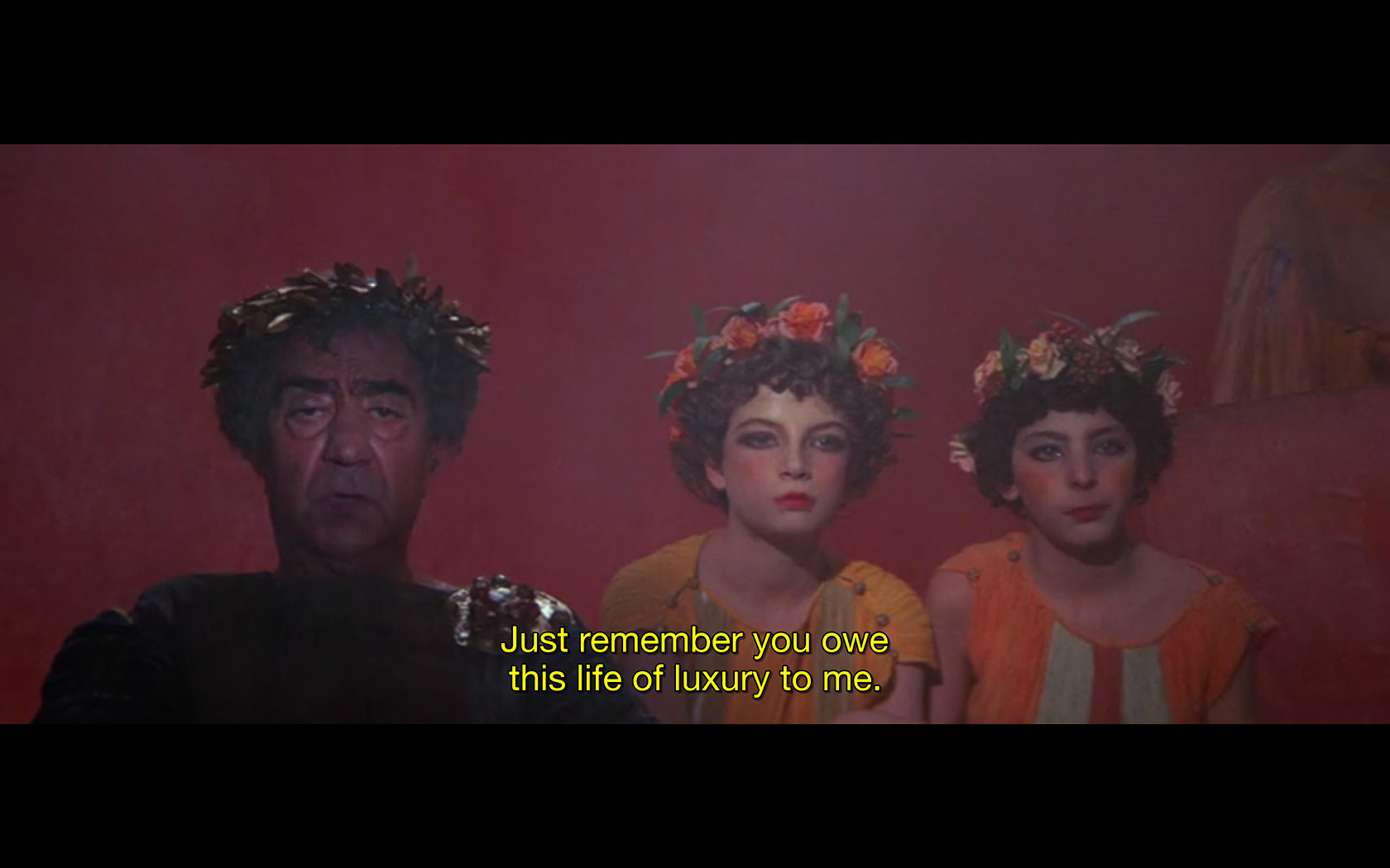
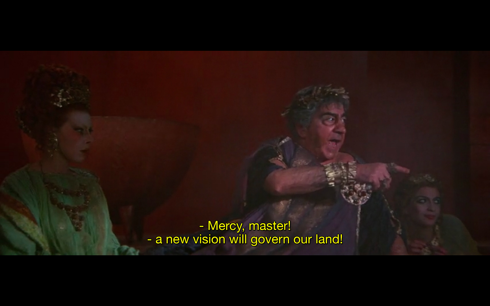
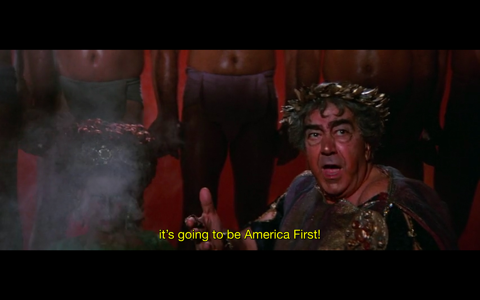
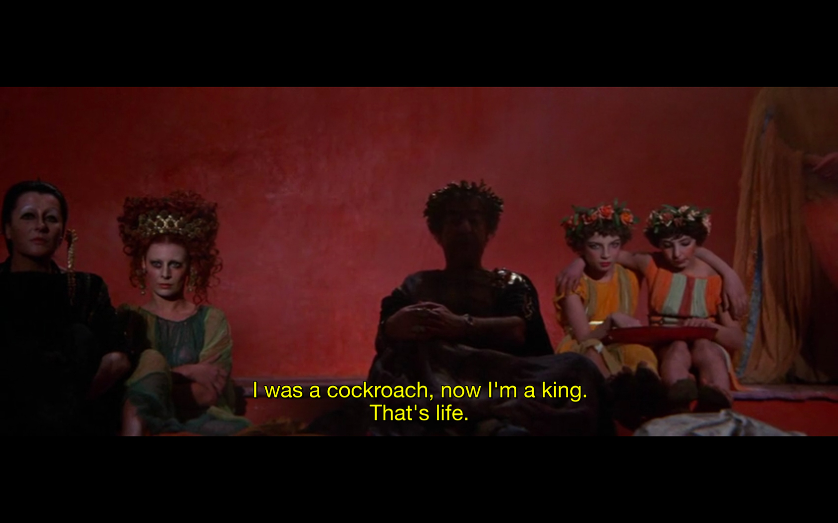
cut-up.
✂️ Trumpmalchio 2018
[as shown in «The copy as a method» workshop w/ Johannes Schwarz, 2018, HGB Leipzig]
A cutup version of Trumps inaugural address 2017 formatted as subtitle data and intertwined with the Trimalchios feast scene of Fellinis Satyricon. ✂️ Trumpmalchio
[as shown in «The copy as a method» workshop w/ Johannes Schwarz, 2018, HGB Leipzig]
A cutup version of Trumps inaugural address 2017 formatted as subtitle data and intertwined with the Trimalchios feast scene of Fellinis Satyricon.
[as shown in «The copy as a method» workshop w/ Johannes Schwarz, 2018, HGB Leipzig]
A cutup version of Trumps inaugural address 2017 formatted as subtitle data and intertwined with the Trimalchios feast scene of Fellinis Satyricon. ✂️ Trumpmalchio
[as shown in «The copy as a method» workshop w/ Johannes Schwarz, 2018, HGB Leipzig]
A cutup version of Trumps inaugural address 2017 formatted as subtitle data and intertwined with the Trimalchios feast scene of Fellinis Satyricon.
various posters and ephemera.
📄 SILKSCREENINGS Stop Making Sense
for movie screenings at the HGB systemdesign class of Maureen Mooren.
part of a screen-printed poster series in collaboration w/ Sibel Beyer and Lea Michel 📄 SILKSCREENINGS
for movie screenings at the HGB systemdesign class of Maureen Mooren.
part of a screen-printed poster series in collaboration w/ Sibel Beyer and Lea Michel
for movie screenings at the HGB systemdesign class of Maureen Mooren.
part of a screen-printed poster series in collaboration w/ Sibel Beyer and Lea Michel 📄 SILKSCREENINGS
for movie screenings at the HGB systemdesign class of Maureen Mooren.
part of a screen-printed poster series in collaboration w/ Sibel Beyer and Lea Michel